Thursday, 29 October 2009

Kenmore Site Visit

After a relatively quiet week, compared to previous weeks, we had a site visit to Kenmore on the Friday. Leaving at 8.30 in the morning, several people didn't make it to Kenmore without catching up on a bit of sleep!

Upon arriving at the site, we were taken for a tour around a rebuilt Scottish Crannog, which is essentially a house built out on stilts at sea. It was fascinating to see how they conquered construction problems thousands of years ago, and how their ideas aren't too far from many of ours at the moment.


The star shapped support structure on the roof caught my attention in particular, also, there was no hole in the roof for letting smoke out, due to the Crannog being high enough for the air to circulate round even when a fire was burning.


The site was 5 minutes walk from the Crannog, so we munched down as much of our lunch as possible on the walk round whilst taking photographs of the site from different angles, this is looking at the site from the beach, the site is the grassy part sticking out in the right of the picture.


Here is a close up of the site, you can just about see the old boat house towards the front of the site.

The next photographs are from the site, and are just a few of the examples of the views out across Loch Tay. On my site plan I have recorded where each photograph was taken from, so as to give some idea of perspective.


Looking back towards the beach:


A close up of the old boat house, which we have been told is set to be demolished.

This is a photo which I was quite proud of, as I managed to get into a postion that nobody else seemed to be able to, I thought it gave a good view of the site and the small beach running down from the site.

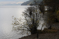
Here are a few examples of activity on Loch Tay, and the type of greenery around the site.

On the walk from the site to the local pub (which is apparently the oldest pub in Scotland), to get some light refreshments, I saw this fantastic delapidated house, which I just had to photograph. There is something intriuging about buildings that have just been abandoned, it is though they are yearning to tell a story, and that the only way of discovering this story is to look closely. Here are some photographs I took of the house, after talking to some locals I discovered that it has been in the middle of an ownership battle for 15 years, and that it hasn't been kept in any sort of respectable form.


The final photograph I took was one looking out from the back of the pub, purely because the extension was fascinating. On the back of what is "Scotland's oldest pub" they have this very 21st century extension, looking out over the river, I'll let you make up your own opinion on it.


Tuesday, 20 October 2009

Analysing Precedent

Another group project, but this time in smaller groups of 3, each group within the year was given a house to analyse and produce work based upon. The house that my group was paired with was the hugely influential Gerrit Rietveld's Schroder House. Designed for 36 year old widow Mrs Truus Schroder, the house was constructed in 1924, however, looking at the photograph below, you would be forgiven for thinking that it was a much more modern construction.
Mrs Schroder was an affluent middle aged widow, with three children, who was looking for a house in which she could settle down and possibly even live the rest of her life. She recognised Rietveld as a fine architect, and was particulary impressed with his work in response to the current De Stijl art movement, fronted by Piet Mondrian. Below is an example of Mondrian's work, all very linear and using mainly primary colours. The De Stijl art movement was described as trying to find the "utopian idea of spiritual harmony and order", which was very much what Mrs Schroder was searching for in her house.


To maintain these principles, Rietveld kept the house very open plan, especially the upstairs which is made up almost entirely of sliding partions. We began by drawing elevations, plans and sections of the house, and from these, creating a 1:50 scale model.


I also drew out a 3-D representation of the house in my sketchbook, so I could form an idea of how the elevations fitted together. The volumetric model was next on the list of things to do, so Ed went down to the work shop, and constructed the spaces which made up each room, out of wood, and colour coded them in co-ordination with the rest of the members of our group as a method of comparison.


After the volumetric model, we started upon the detailed model, which was to prove the most stressful and complicated of the models. Ed and me each took one floor, the ground floor for Ed and the first floor for me, respectively, and spent several days constructing an accurate 1:50 scale model of the house, including, balconies, windows, doorways, units and the stairway.


The site model was probably the most useful of the models as it really put the house into perspective with it's surroundings and made up realise how outrageous yet fantastic Rietveld's idea was. The way that the very linear, white coloured Schroder House works with the dull, terraced buildings next to it, is really quite something, whether or not you think it works.


Another extremely difficult part of this project was to get our heads around the ridiculously complicated stairs, which seem completely out of place in an otherwise relatively spacially simple house. I made the following stair set, and also made another version of the top floor, showing what the house can look like when all the sliding partions are closed, which really puts the complexity than can be achieved in perspective.


For our presentation, we decided to display the four houses in our tutor group as a set, so that comparisions could be drawn. Fergus drew out the 8 elements drawings, showing the very basic make up of each building, and then the sheets below showed detailed plans, sections and elevations. The shelves at the side each displayed a site model and the volumetric model.


I thoroughly enjoted this project, especially investigating into the background of the client to find out why certain aspects were chosen for the house. It also helped us bond even more now as a group, which is an invaluable skill. It was also the first time that our model making skills were put to the test, there were several times in the studio when I sat down to make a model and didn't get up again for several hours as I was so immersed in it, especially in making the detail model. We also gained valuable insight into the other houses in our group, and could draw comparision, such as the sliding panels in our house inspired the sliding paritions in the Nine Square Grid House.

Monday, 12 October 2009

Mapping Entrance


Our group was assigned to map the Carnelly entrance, which we realised after several minutes was going to be quite difficult due to the height of the doorway and the overhang. It was over 7 metres high and about 5 metres wide including the or
nate lamps at the bottom of the steps.

We used 25 sheets of paper, which were larger than AO, so in total we each had two large sheets to do. We decided to render the drawing in pastel, coloured pastel, pen, pencil and crayon, so that we would have a variation of mediums.

Images of the final product to come.

Inspiring Places

For my "inspiring place", I chose not a place which particularly intrigued me in a positive way, but more made me think about the ideas involved in the architecture of the building and the relationships with the buildings around it. When I first arrived in Dundee and had a walk around the city centre, there was one place that caught my eye, this was the very 70's looking, dull Mecca Bingo and the ornate church situated next to it. The way in which the Bingo has been constructed, looked almost as if the architect was trying to echo the spire of the church.

I tried to find other ways in which the Bingo looked as if it was trying to echo the el
egance of the church. I also did some research into the background of the architecture, and it was interesting to discover that the Bingo was in fact an early 1990's rebuild. It was constructed during a period of time when the Government was encouraging the growth of businesses in Dundee, Bingo being one of these, as it is an activity aimed at generating large amounts of income from relatively small input.

Another relationship I noticed was the two tall pillar like decorations on the fronts of the buildings.


I also did several drawings of which I will upload scans of at a later date.

Friday, 2 October 2009

Tentsmuir Beach

For our very first assignment we were taken to Tentsmuir Beach with the second year students. The aim of the project was to design and construct a marker on the land, using any materials we could lay our hands on. However, it was key that we did not damage the existing environment. Before we could construct our marker we had to pick a location which appealed to us, after much deliberation my group chose this small plot of land, which was slightly elevated from much of the surrounding area, providing excellent views out across the rest of the beach.

We decided to construct a shelter on our chosen plot of land, and we wanted to go about doing this using entirely natural materials. After several trips to and from the forest, we built up the base of the shelter, trying to base the idea on a birds nest, using the interlocking of the branches to hold the structure together.

We continued to interlock the branches until we had built up a quite secure and robust structure. The idea was to provide shelter from the elements, especially the wind, but without losing the fantastic views.

.


Welcome To My Blog!

Hey, I am currently a first year architecture student at the University of Dundee, this blog will keep you up to date on my thoughts, ideas and the work which I am doing. I am originally from Newcastle and I attended Newcastle Royal Grammar School. At A level I studied Art, Geography and Maths, and in my art I was particularly interested in the works of Barry McGee, Rachel Whiteread and Mona Hatoum. In my spare time I play football and I love music, my musical tastes vary immensely, from De La Soul to Sonic Youth to Serge Gainsbourg. However, my 3 favourite artists are Bright Eyes, Joy Division and My Bloody Valentine.